Your campaign shows an open rate that looks wonderful and a reply count that does not. Before you conclude that people are reading and declining, consider the simpler explanation: a large share of those opens were never made by a person.
Since Apple introduced Mail Privacy Protection, the Mail app on iPhone, iPad and Mac can fetch the remote content of incoming messages in advance, through Apple’s own servers, so that the sender cannot tell when or where the recipient actually opened it. The tracking pixel that open tracking relies on is remote content. It gets fetched. The tracker records an open. The recipient may be asleep.
This article covers what the feature does, why it inflates rather than hides opens, which comparisons still work, which have stopped working, and what to look at instead when you want to know whether a prospect is paying attention.
What Mail Privacy Protection does
Open tracking works by placing a small image at a unique address in each message. When the mail client loads the image, the request is logged as an open. This depends on the client loading the image at the moment the person reads the message, from the person’s device.
Mail Privacy Protection breaks both assumptions. When it is on, Apple Mail may download remote content when the message is received, or at some other time unrelated to reading, and it routes the download through Apple’s relay so that the request does not reveal the recipient’s IP address or location. Apple describes the behaviour in its Mail user guide. The feature is offered to users when they set up Mail, and many accept it.
From the tracker’s point of view, a pre-loaded pixel and a real open look identical: a request for the image. The open is counted either way.
Where the inflated open counts come from
It is tempting to think of privacy features as hiding opens. This one does the opposite. Because the pixel is fetched for messages that are never read, open counts go up. A campaign whose recipients all used Apple Mail with the feature on would show something close to every delivered message as opened, regardless of whether anyone looked.
Most lists are a mix. Some recipients use Apple Mail with the feature on, some use it with the feature off, some use Outlook, Gmail’s web interface, or a corporate client with images blocked by default. The last group produces the opposite distortion: they can read every word and register nothing, because the pixel is never loaded. Your open rate is the sum of real opens, phantom opens from pre-loading, and silence from image blockers, and you have no way to separate the three.
That is why the number cannot be read as a share of people who saw the message. It is a count of image requests, some of which were made by people.
Which comparisons still hold
The distortion is not random, and that is what saves some uses of the number. Within a single campaign, sent to a single list over a short period, the mix of mail clients is roughly the same for every message. Whatever inflation Apple Mail adds, it adds to both sides of any comparison inside that campaign.
So a subject line test still works. If variant A shows more opens than variant B on the same list in the same week, A probably did better; the phantom opens are distributed across both. The variant comparison table in the campaign Stats tab is built for exactly this. The wider method is in A/B testing cold email subject lines and variants.
Comparing steps within one sequence also holds, with a caveat. Step one goes to everyone; step three goes only to people who have not replied. The populations differ, so a drop in opens from step one to step three is partly the list thinning and partly interest fading, and the pixel cannot say which.
Changes over time within one campaign are worth a look too. If a campaign’s opens fall sharply from one week to the next with no change to the list or copy, something happened to delivery, because the client mix did not change overnight. Confirm it with bounces and replies before acting.
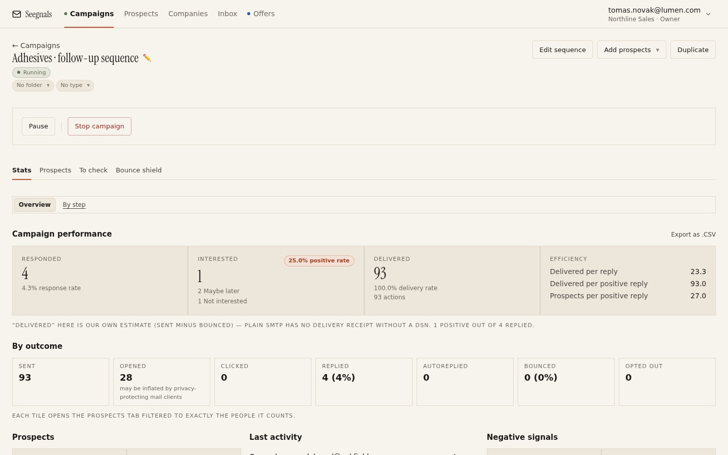 Responded and Interested sit first for a reason; Opened is further along and carries a note about Apple Mail, because it is the least reliable tile on the page.
Which comparisons no longer hold
Comparing your open rate against any outside figure is over. Whatever number a guide, a vendor or a colleague quotes was measured on a different list with a different client mix, before or after the feature spread, with a different share of phantom opens. The comparison tells you nothing about your campaign.
Comparing two of your own lists is nearly as bad if the lists differ in who is on them. A list of designers and founders, who skew toward Apple devices, will show higher opens than a list of plant managers on corporate Outlook, for reasons that have nothing to do with your message.
And using the open as a trigger for action has become risky. A sequence step that says “if opened but not replied, send the nudge” fires for people who never saw the first message. A sales rep who calls “because they opened it three times” is calling someone whose phone pre-loaded the image three times. If you build conditional steps, build them on replies and clicks.
What to watch instead
The distortion makes the case for signals that require a person to do something.
A click is a decision. It can be polluted by security scanners that follow links before delivery, but a click from a prospect who then spends time on the page is hard to fake. If you track clicks, do it through a domain you own, as explained in custom tracking domain for opens and clicks.
A reply is a person. Whether the reply is interested, not interested, or an out-of-office message, someone or something at the other end engaged, and the reply classifier sorts which.
A proposal read is a person with time. When you send an offer through a tracked link and the recipient spends minutes on page four, that is attention no pixel can invent.
Seegnals rolls all of these into the company view. Every prospect belongs to a company, and the company card shows a timeline of events across everyone there (sent, opened, clicked, replied, offer viewed, offer returned) and a temperature that rises with engagement. Opens are in that timeline, but they are one entry among several, and the temperature does not rest on them alone.
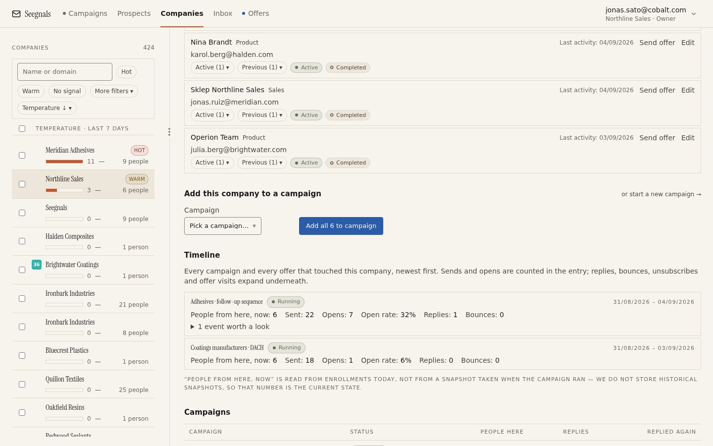 Three people at one company, a click, a reply and an offer view: this is what engagement looks like when the pixel is only one voice among several.
The dashboard lists the hottest companies by that temperature, so the question “who is paying attention” is answered by a mix of signals rather than by the one signal Apple Mail has made least reliable. The company view page describes how the temperature is built.
Why the note is there
Seegnals shows open rates. It also shows a note next to them about Mail Privacy Protection inflating the count. The note is not an apology for the feature; it is a reminder that the number is a rough direction and should be read with the mechanics above in mind.
A tool could hide the number instead. That would remove the one legitimate use, comparing variants inside a campaign. It could show the number without the note, which is what most tools do, and let people build sequences and calls on it. The note is the honest middle: here is the number, here is why it is inflated, decide accordingly.
What to do this week
- Find any conditional step, task or alert in your process that triggers on an open. Change it to trigger on a reply or a click, or remove it.
- Stop comparing your open rate to any figure from outside your own campaigns, and tell whoever asks for that comparison why it no longer means anything.
- Keep variant tests inside one campaign on one list, and read the variant comparison table as a relative result.
- Open the dashboard and look at the hottest companies. Compare that list with the one you would have made from opens alone, and notice where they differ.
- If you are tracking through a shared host or not at all, decide this week whether to set up a custom tracking domain so that the clicks you do count are yours.