Guide · Practitioner · 20 min read
Account temperature: how to read engagement across a whole company
A practical method for reading engagement per company rather than per contact: which events count, how signals from several people add up, and what to do at each level.
Most outreach tools show you engagement one row at a time: this person opened, that person clicked, a third one has not replied. That view is honest about individuals and blind to the thing you are actually selling into, which is a company. Decisions in B2B are made by groups, forwarded between colleagues, parked for a quarter and revived by someone you never wrote to. If you read engagement per contact, you see fragments of that story and act on the wrong ones.
This guide is about the method behind account temperature: a way of reading everything that happens at one company, across all the people you have contacted there, all your campaigns and every proposal you have sent, as a single level that you can compare from week to week. It is written for founders, sales leads and SDRs who run outbound to a defined list of accounts and want to know, each morning, which accounts deserve attention today and what kind of attention.
By the end you will be able to say which events count and how much, explain why three colleagues opening in one afternoon means more than one person opening six times, compare the last seven days with the previous seven for any account, translate the result into one of three operating states (hot, warm, no signal) with a defined action for each, and recognise the situations where the number is misleading you. The examples use Seegnals, where every prospect belongs to a company and each company card carries a timeline and a temperature, but the method works in any tool that lets you see events by domain, and a rough version works in a spreadsheet.
Why the company, not the contact, is the unit you measure
Buying is a group activity
When you sell a product of any complexity to another business, the person who answers your email is rarely the only person involved. An operations manager forwards your note to a plant director. The plant director asks procurement to look at your pricing. Procurement asks IT whether the integration is realistic. None of these people were in your original sequence, and yet they are the ones deciding.
Reading engagement per contact means you see the operations manager open once and go quiet, and you mark them as cold. Meanwhile, three other people at the same domain have read your proposal. The information was there. Your view hid it.
What an account view shows that a contact view cannot
An account view groups every event by the company it belongs to. In Seegnals that grouping is by email domain: every prospect with an address at the same domain belongs to the same company card, and every event those people generate (sent, opened, clicked, replied, offer viewed, offer returned) lands on one timeline. The company view is built around that card, with the list of companies on the left and the selected company on the right.
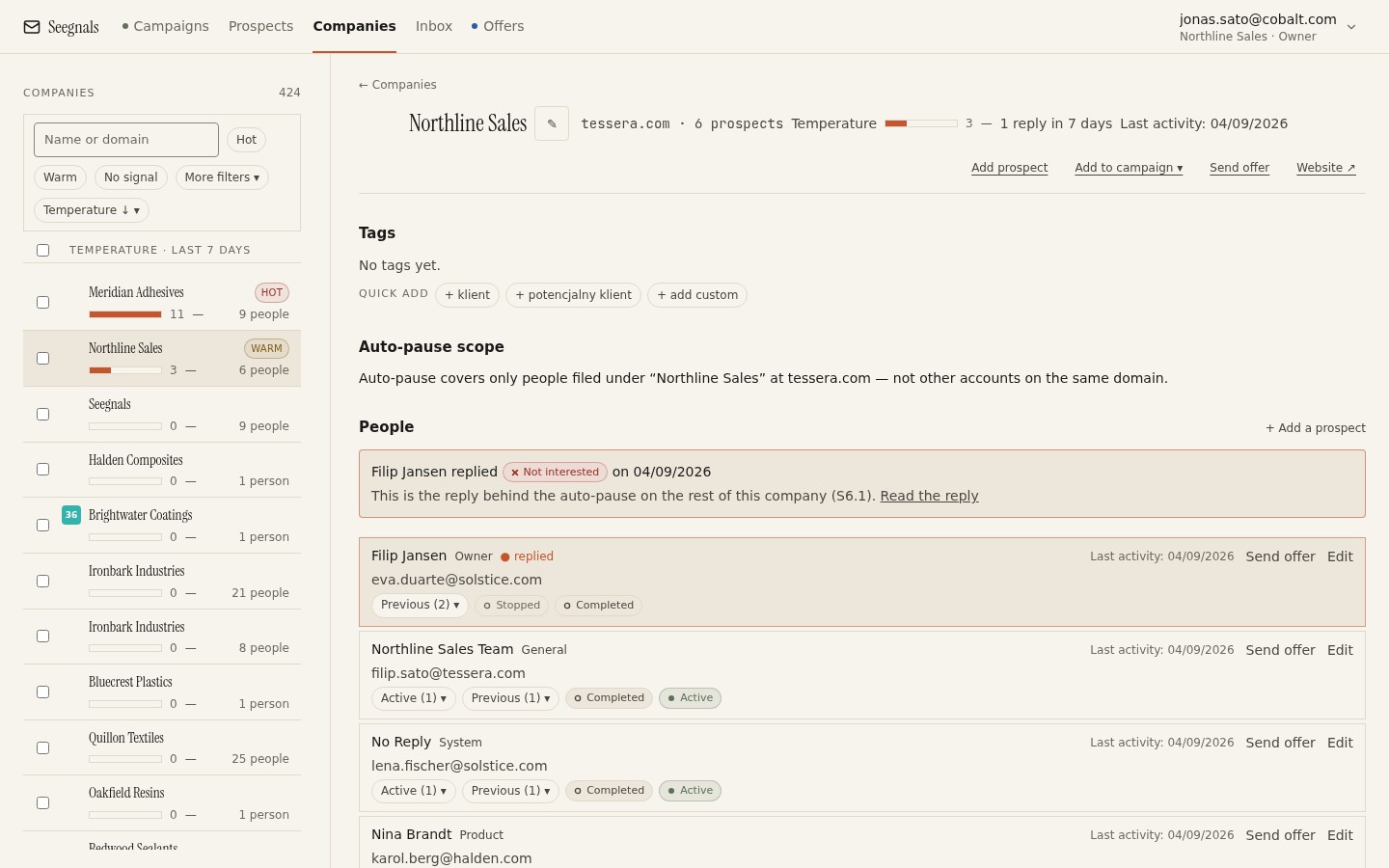 The company, not the row, is the thing you look at: everyone you have written to at this domain, and everything they did, in one place.
Three things become visible that a contact table hides. First, breadth: how many distinct people at the account have shown any sign of life. Second, sequence: who engaged first, and who followed after them, which often tells you who forwarded what to whom. Third, momentum: whether the account is doing more this week than it did last week, or less.
Temperature as a summary, timeline as the evidence
A temperature is a summary number. It rises with engagement at the account, and it lets you rank accounts so that the ones with the most recent activity float to the top. The dashboard in Seegnals lists the hottest companies for exactly this reason: it is the shortest route from “I have 400 accounts” to “these six need me today”.
A summary is only as good as the habit of checking it against its evidence. Every time the method below tells you to act, the first step is the same: open the card, look at the timeline, and confirm that the events behind the number are the kind you think they are. The number ranks. The timeline explains.
The classic mistake: measuring engagement per contact
How the mistake happens
Nobody chooses to measure per contact. It is the default, because a mailing tool stores one row per address and reports on rows. Open rate, click rate and reply rate are all averages across rows. Each of them can be honest about individuals and still misleading about accounts.
Say you contact three people at each of 200 companies. Your contact-level report says 600 people were emailed, some opened, some replied. It cannot tell you that at 30 of those companies all three people opened, that at 120 exactly one person opened, and that at 50 nobody did. Those are very different situations that a per-contact average flattens into a single figure.
What it costs you
The cost comes in three forms. You follow up with the wrong person: the one who opened, when the one who forwarded is the one who matters. You misjudge the account: a single enthusiastic contact makes a dead account look alive, and a silent champion makes a live account look dead. And you double-contact people: two colleagues at your side write to two colleagues at the same account in the same week, because each of you was looking at your own rows.
The fix is a change of grouping, not of tool
You do not need a new tool to stop making this mistake, although a tool that groups by company makes it much easier. In a spreadsheet, extract the domain from each email address, add a column for event type and one for the date, and build a pivot with domain as the row. You have an account view. What you cannot get in a sheet is the live part: the sequence stopping when a colleague replies, the account moving up a ranked list the moment a proposal is opened. That is what a company view in the product adds.
Which events count and how much each one deserves
Not all events are equal. The method depends on a rough hierarchy, and the hierarchy depends on one question: how likely is it that a human at the account did this on purpose?
Sends: the baseline, not a signal
A send tells you nothing about the account. It tells you about you. Its only role in reading temperature is as a denominator: five people engaging out of five contacted is a different account from five out of twenty. Record sends so you know how much you have asked of an account, and so you can spot accounts you have been writing to for weeks with no result.
Opens: weak individually, useful in aggregate
An open is recorded when the tracking pixel in your message is fetched. That can be a human reading. It can also be a mail client prefetching images, or a security gateway scanning the message before it reaches the inbox. Apple Mail Privacy Protection fetches images on behalf of many recipients regardless of whether anyone read the message, which is why open rates after Apple Mail Privacy Protection need a note beside them, and why Seegnals shows one.
Two rules. Never act on a single open. Do act on a pattern of opens across several people, especially when they cluster in time. One person opening once is noise; three people opening within an hour is a forward.
Opens also depend on tracking being switched on. Without a verified custom tracking domain Seegnals does not track opens or clicks at all and says so in the interface. In that case the temperature rests on replies and offer events alone, which is a smaller but cleaner signal.
Clicks: stronger, with a timing check
A click means someone followed a link you sent. Humans do this. So do link scanners in corporate email security, and they do it within seconds of delivery. The check is simple: look at the gap between the send and the click on the timeline. A click seconds after the send is a machine. A click twenty minutes later, or the next morning, is a person.
Replies: the strongest positive signal, once classified
A reply is a human act. It is also ambiguous until you know what it says. Seegnals classifies replies automatically as Interested, Maybe later, Not interested, Autoreply / Out of office, Bounce, Unsubscribe request or Other, and a classified reply stops the sequence for that person. For temperature, the classification matters as much as the reply itself: an Interested reply is the hottest event an account can produce, a Maybe later is a warm one with a date attached, an Out of office is not engagement at all and should not warm anything.
How to handle each category is covered in sorting replies: interested, maybe later, not now and, for the automatic ones, what to do with autoreplies and out of office.
Offer visits and returns: intent with a timestamp
When you send a proposal as a tracked link rather than an attachment, every visit is an event: when, how long, on what device, how far the reader got. A return visit, the same person coming back a second or third time, is one of the clearest intent signals in outbound because nobody re-reads a proposal they have already dismissed. A visit from a device you did not expect usually means a forward.
These events belong on the same timeline as the emails. In Seegnals they do: offer viewed and offer returned sit beside sent, opened and replied on the company card, and they raise the temperature. How to read them in detail is the subject of reading time per page.
Bounces and unsubscribes: events that cool an account
Two event types point the other way. A hard bounce means the address does not exist; it tells you your data on this account is stale and it raises your bounce rate, which is a deliverability problem before it is a sales problem. An unsubscribe request is a person saying no, and under the one-click unsubscribe standard (RFC 8058) that no must be honoured at once.
For temperature, treat both as cooling. However your tool handles the arithmetic, an account where one person unsubscribed should not be hot on the strength of two other people’s opens. Check the campaign’s Bounced and Opted out tiles before you act on any account, and keep your suppression list as the place where a “no” becomes permanent.
A working hierarchy
Written down, the hierarchy looks like this, from weakest to strongest positive evidence:
- Send: no signal, baseline only.
- Open: weak, count only in patterns across people.
- Click: moderate, after the timing check.
- Offer visit: strong, especially the first one.
- Offer return: very strong.
- Reply classified Maybe later: strong, with a date.
- Reply classified Interested: the strongest.
And the cooling events: Autoreply / Out of office (neutral, ignore), hard bounce (cool, fix the data), unsubscribe request (cool, and remove from every list).
How signals from several people add up
The whole point of measuring per account is that events from different people combine. How they combine is where judgement comes in.
Same event, different people, is worth more than the same person twice
One person opening six times is one person. It may be a keen reader, a phone that keeps re-fetching images, or a message left open in a preview pane. Three different people opening once each is three people, and it means your message has moved inside the building. Breadth beats depth at the account level. When you rank two accounts with the same number of events, prefer the one with more distinct people behind them.
Clustered in time versus spread over weeks
Look at when the events happen relative to each other, not only how many there are. Six events spread over four weeks is an account that keeps a mild interest. Six events in one afternoon, from three people, is an account where somebody just forwarded your email with a comment. The second one is a window that closes; act the same day.
The forward pattern
The most valuable shape on a company timeline is this: person A opens, then within an hour or two persons B and C (whom you may or may not have contacted) open or visit the offer. A forwarded it. B and C are the people A thinks should see it, which tells you something about who decides. If B and C are not in your list, they are now your best next contacts, and the reply you eventually get may come from one of them rather than from A. That case is the subject of when a colleague replies instead of your prospect.
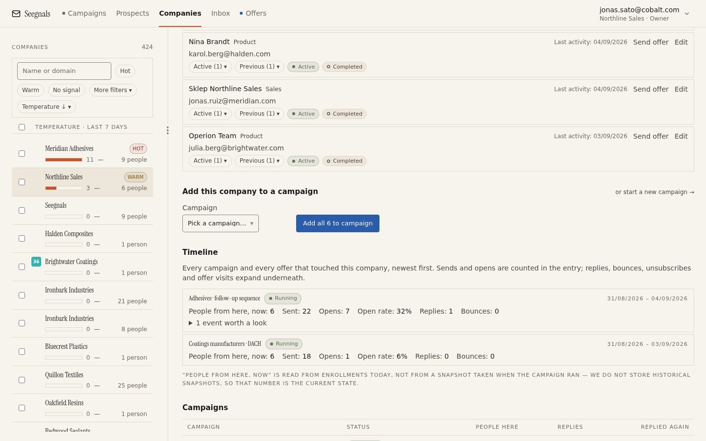 Three people, one afternoon, one proposal opened twice: this is what a forward looks like on a timeline, and it is worth more than any single open.
One person, many events
The reverse pattern, one person generating everything, calls for caution. If one contact opened, clicked and visited the offer three times, and nobody else at the account has done anything, you have a champion, not an account. Champions are valuable, but the account is not warm until the champion has brought someone else in. Your next move is to help them do that: offer a short summary they can forward, or ask directly who else should see it.
How many people you need to see anything
You cannot read breadth if you only contacted one person. The method presumes you write to several people per account, sequenced rather than all on day one, so that the timeline has room to show who moved after whom. How many that should be, and in what order, is covered in how many people to contact in one company.
Comparing the last seven days with the previous seven
Why a window and not a lifetime total
A lifetime total rewards accounts you have been contacting for a long time. An account you wrote to in March that opened eight emails and then went silent has a big total and no life in it. What you want to know is direction: is this account doing more now than it was, or less?
The simplest way to get direction is to compare two windows of equal length: the last seven days and the seven days before that. Seven is a convenient span because it contains one full working week and smooths over the day-of-week effects that make Monday look different from Friday.
The four shapes
Compare the two windows for each account you care about, and you will find four shapes.
| Shape | Last 7 days against previous 7 | What it usually means | What you do |
|---|---|---|---|
| Rising | More events, or more people, this week | Something moved internally | Act this week, on the newest people |
| Steady | Similar activity both weeks | Mild ongoing interest | Keep the sequence running, no extra push |
| Fading | Clearly less this week | Interest peaked and is cooling | Change the angle or park with a date |
| Silent | Nothing in either week | No engagement, or the account is done | Rotate people, then rest the account |
Rising is the shape that pays. It is also the one most often missed by contact-level reporting, because the rise usually comes from new people, not from the original contact doing more.
Doing it by hand
If your tool has a timeline, the comparison is a matter of looking. Open the company card, find the point seven days back, and count events and distinct people on each side of it. It takes seconds per account and you only need to do it for the accounts near the top of the ranking and the ones you are about to follow up with.
What not to do with the comparison
Do not turn the difference into a target. An account is not better because its number went up by more; it is better because the events behind the number are the strong kind. A rising account whose rise is five opens from one person is weaker than a steady account with one Interested reply. Direction sorts; the hierarchy of events decides.
What hot, warm and no signal mean, and what to do at each level
The comparison and the event hierarchy together let you put every account into one of three operating states. The labels are less important than having a defined action per state, agreed across the team, so that two people looking at the same account do the same thing.
Hot: a human at the account acted on purpose, recently
An account is hot when, in the last few days, it produced at least one strong event (an Interested or Maybe later reply, an offer visit or return, a click that passed the timing check) or a forward pattern across several people. Hot accounts are few. On a list of a few hundred, a handful at a time is normal.
What you do: pick up the thread, do not start a new one. Reply to the person who replied, or write to the person who visited the offer, referencing what they looked at. If the forward pattern brought in new people, contact the newest person first, because they are the one currently paying attention. Do not treat the next scheduled sequence step as the follow-up; the sequence has done its job. In Seegnals the classified reply has already stopped the sequence for the person who replied. Check whether other people at the account still have steps pending and decide whether those steps should still go out now that the conversation has moved to one thread.
The full playbook for this state is hottest companies: what to do when an account heats up.
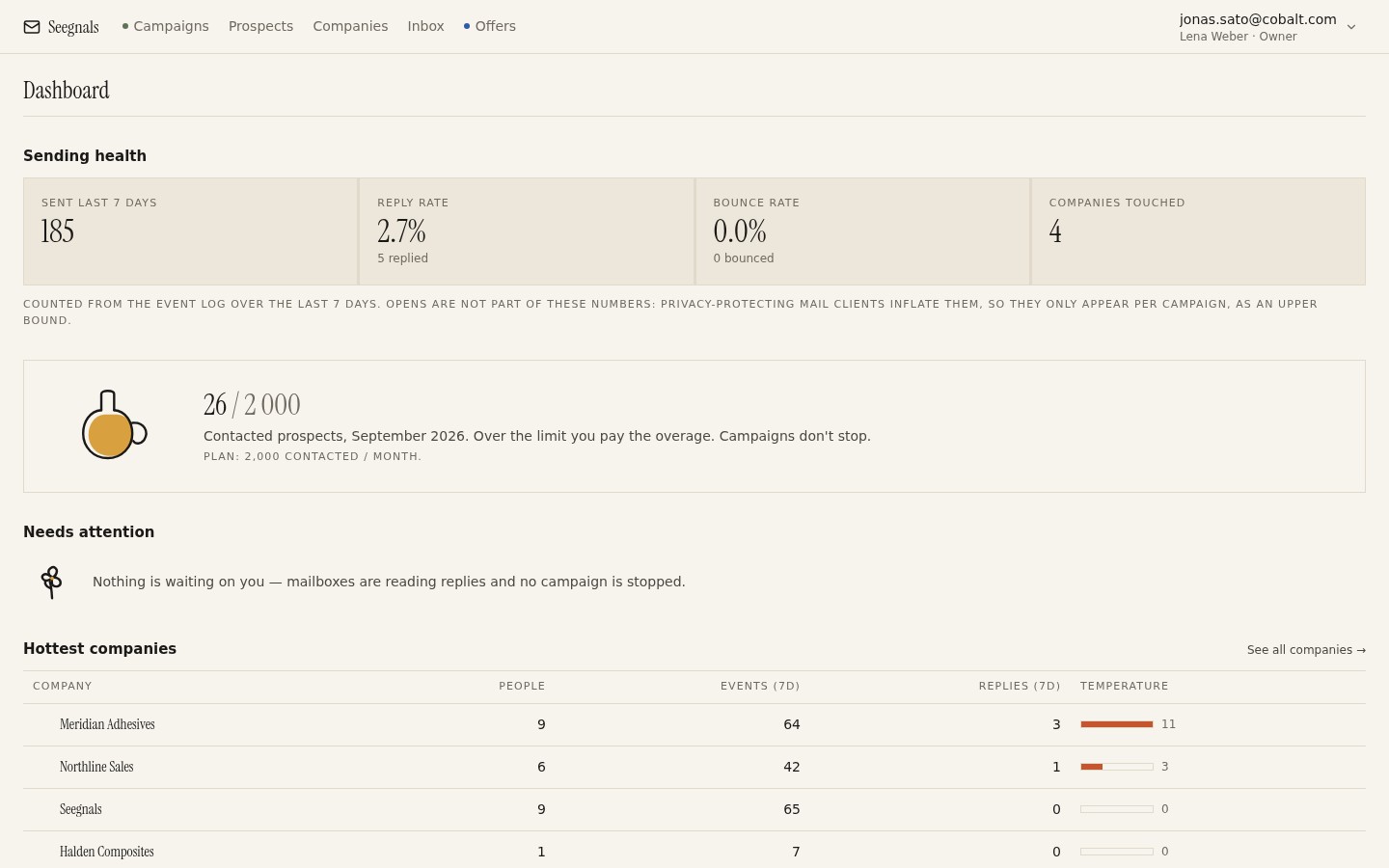 The dashboard puts the hottest companies at the top of the day; the job is to open each one and confirm that the heat is the human kind before you write.
Warm: signs of life, nothing decisive yet
An account is warm when there are opens across more than one person, a click that passed the timing check, or a steady trickle of events over two windows, but no reply and no offer event. Warm is the largest of the three groups and the one where most of the judgement lives.
What you do: change the angle, not the volume. A warm account has seen your message and not acted on it; sending the same message harder will not help. Try a different person, a different problem statement, or a shorter note that asks one question. If you have a proposal or a one-page summary, a warm account is where a tracked link earns its keep, because a visit will tell you whether the interest is real. Do not escalate to a call on the strength of opens alone.
No signal: nothing you can act on
No signal means no events beyond sends, or only events that fail the human test (instant clicks, opens with no pattern). It also includes accounts that were once warm and have been silent for two windows.
What you do: rotate, then rest. If you have contacted one or two people, add one more in a different role and let the sequence run. If you have contacted the roles that make sense and heard nothing, stop. Mark the account with a date to revisit, and move the effort to the accounts that are moving. Continuing to send into silence raises your volume without raising your results and, over time, hurts your sending reputation.
Cooling is a transition, not a state
An account that was hot and is now fading is not “no signal”. It is a hot account that you are about to lose. Treat the transition as its own trigger: a proposal that was read twice last week and not at all this week deserves a short note now, not a place in the resting pile. When to follow up on a proposal based on reads covers the timing.
A short operating checklist
- Each morning: open the ranked list, check the top accounts’ timelines, confirm the events are human.
- For each hot account: reply in the existing thread or to the newest engaged person; review any pending steps for other people at that account.
- For each warm account: decide on one change (person, angle or format) and make it once.
- For each account silent for two windows: rotate one more role or rest it with a revisit date.
- Weekly: compare windows for every account you followed up with last week and note the shape.
What temperature does not tell you
A summary number is easy to over-trust. These are the things it cannot tell you, and the habit that compensates for each.
Fit
Temperature is behaviour. It knows nothing about whether the company is the right size, in the right industry, or in a position to buy. A well-fitting account with no engagement is still a better account than a hot one that could never buy from you. Fit is decided when you build the list, before any email is sent, and it is why list quality before import matters more than any downstream metric. Keep fit in a separate column and read the two together.
Who decides
The temperature rises whoever engages. It does not know that the person who opened three times is a junior analyst and the one who opened once is the director. Reading the timeline tells you who did what; reading their titles tells you what it means. Neither is in the number.
Why they engaged
A visit to your proposal might be enthusiasm, due diligence, or a competitor benchmarking you. A forward might be “look at this, we should do it” or “look at this, we should never do it”. The temperature records that something happened, not what it meant. Only a reply, or a call, tells you that.
Whether the deal will close
Temperature is a leading indicator of attention, not of revenue. Attention is a precondition for a deal, not a promise of one. The place where this confusion does the most damage is in reporting: a team that reports “hot accounts” as if they were pipeline will be disappointed, and a team that reports reply rate as its main number will be measuring the wrong thing, as argued in reply rate is the wrong north star.
Reading temperature together with the inbox and offers
Temperature ranks. The inbox and the offers tell you what to say. Used together, in a short daily loop, they cover most of what a small outbound team needs to run.
The morning loop
Start with the ranked list of companies. For each of the top accounts, open the card and read the timeline. Then go to the inbox and read the replies that arrived, with the company context beside each thread. Then check the offers list for visits and returns since yesterday. The whole loop, for a list of a few hundred accounts, is a matter of minutes, because the ranking has already done the sorting.
The inbox: the classified reply beside the company
A reply is the strongest event, and the inbox is where you handle it. Seegnals brings replies from every connected mailbox into one place, classified, with the company context beside the thread. That last part is the point: when you answer a reply, you can see that two other people at the account visited the offer yesterday, and you can write accordingly. A reply answered without the account context is a reply answered half-blind.
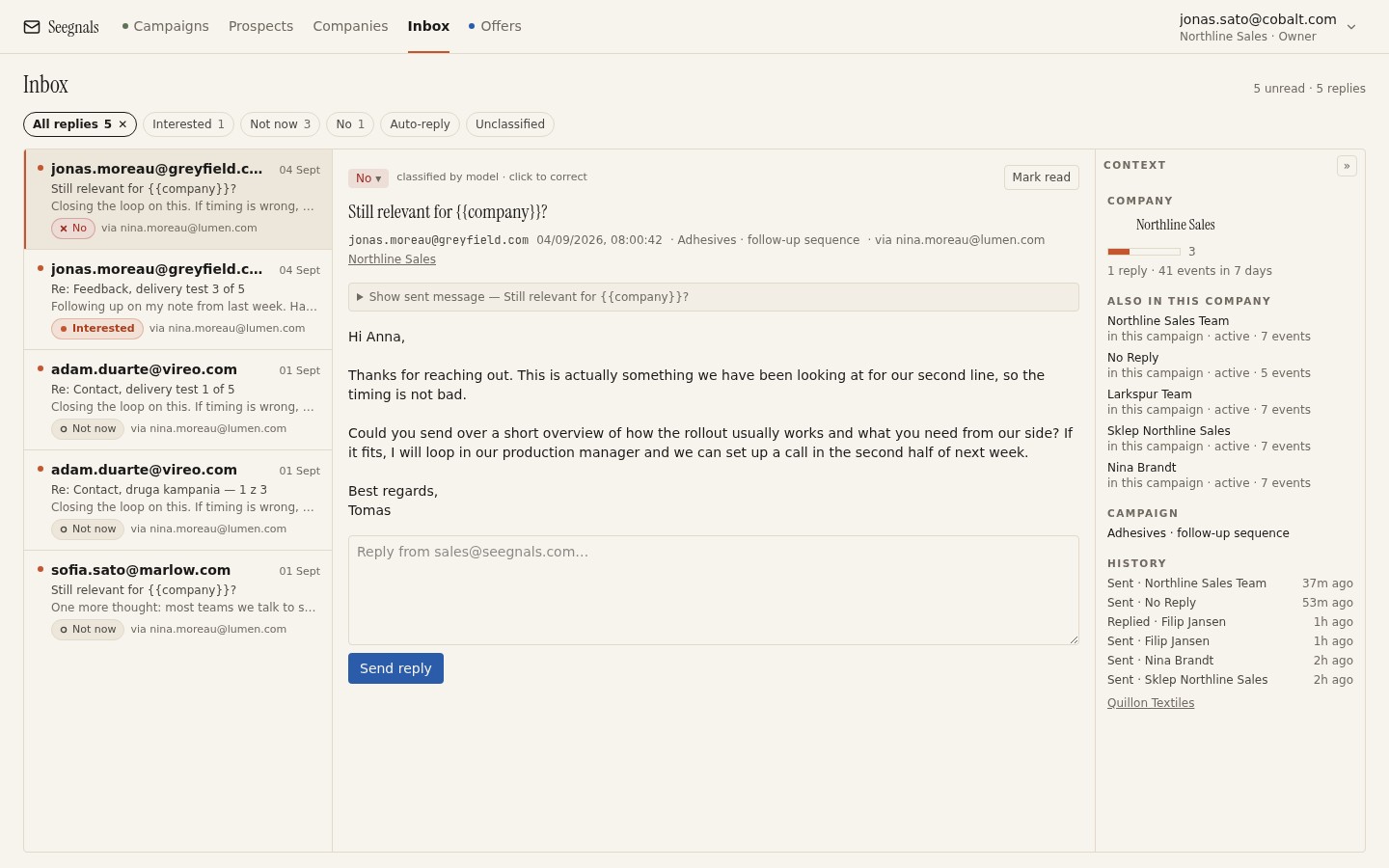 The reply on the left, the account on the right: you answer the person knowing what their colleagues did this week.
Offers: the second thermometer
Once an account is warm enough to receive a proposal, the proposal becomes the more precise instrument. Reading time per page tells you which pages held attention and which were skipped. Returns tell you who came back. A visit from a second person tells you the proposal has been forwarded, and to whom, if the gate is on and they identified themselves.
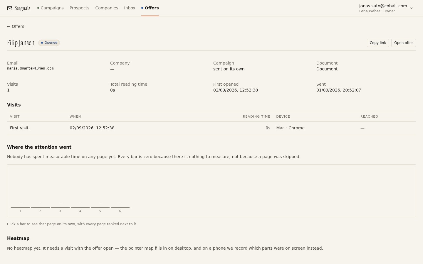 The pricing page read three times by two people calls for a different follow-up from the introduction read once; the offer statistics tell you which one you are writing.
Fold this back into the account. An offer return is an account-level event; it should move the account up your list even if the emails have gone quiet. The mechanics are in proposal tracking: what happens after you send the PDF and who else opened your proposal.
A weekly review of the method itself
Once a week, look back at the accounts you called hot seven days ago and count how many produced a conversation, and how many turned out to be scanner clicks or a single champion. That review is how the thresholds get tuned to your market. There is no universal weight for an open or a click; there is the weight that, in your list and your market, turned out to predict conversations.
Where to go from here
- Account-based cold email: why the company is the unit makes the case that this guide assumes.
- Company temperature: reading engagement across people is the shorter article on the same signal, with the spreadsheet version.
- Hottest companies: what to do when an account heats up is the detailed playbook for the hot state.
- How many people to contact in one company covers the sequencing that gives the timeline something to show.
- Reading time per page: what proposal analytics tell you is the offers half of the method.
Questions people ask
What is account temperature in outbound sales?
It is a level attached to a company rather than a person that rises as people at that domain open, click, reply or view a proposal across your campaigns. It is used to rank accounts so the most active ones are seen first each day.
Why measure engagement per company instead of per contact?
Because B2B decisions involve several people and the person who replies is often not the one you wrote to. A per-contact view shows fragments; a per-company view shows who moved after whom and whether the account is doing more this week than last.
Which events should count towards account temperature?
Replies classified as interested or maybe later, proposal visits and returns, and clicks that pass a timing check are strong. Opens are weak and only count in patterns across people. Bounces and unsubscribe requests should cool the account.
How do I tell a real click from a security scanner?
Look at the gap between the send and the click. A click within seconds of delivery is a link scanner in the recipient's email security. A click minutes or hours later is a person.
What does a hot account mean in practice?
A human at the account did something deliberate in the last few days: replied, visited a proposal, came back to it, or forwarded your email so that colleagues opened it. The action is to reply in the existing thread or write to the newest engaged person, not to send the next sequence step.
Can account temperature predict whether a deal will close?
No. It measures attention, which is a precondition for a deal, not a promise of one. It also says nothing about fit or about who at the company decides. Read it beside the timeline, the reply itself and the proposal's reading data.
Written by